A quick analysis of Covid-19 data obtained from the London Datastore (December 2020)
London entered into Tier 4 lockdown on Sunday 20th December 2020. Let’s take a look at the cases across Greater London and see if the data tells us anything

Data is available since 11 February 2020 and runs through to 22 December 2020. The first graph shows the number of confirmed coronavirus cases recorded each month with a running total represented by the line. In March, the government began ramping up their testing infrastructure, with 10,000 confirmed cases identified in London alone (see graph above). Things started getting serious when national lockdown was implemented on 23 March 2020 and it seemed to be working out, because the number of new cases fell below 2,000 in both June and July. This led to the relaxation of restrictions, despite calls for caution from the experts
After August the growth is exponential. It’s important to note that this data is simply confirmed new cases and the numbers don’t reduce for people who had the coronavirus and recovered from it.
How on earth the cases rose from 53k to 279k over the last quarter of the year is beyond me, but it is quite astounding that despite being in the midst of a global pandemic, people have managed to spread the disease as much as they have.
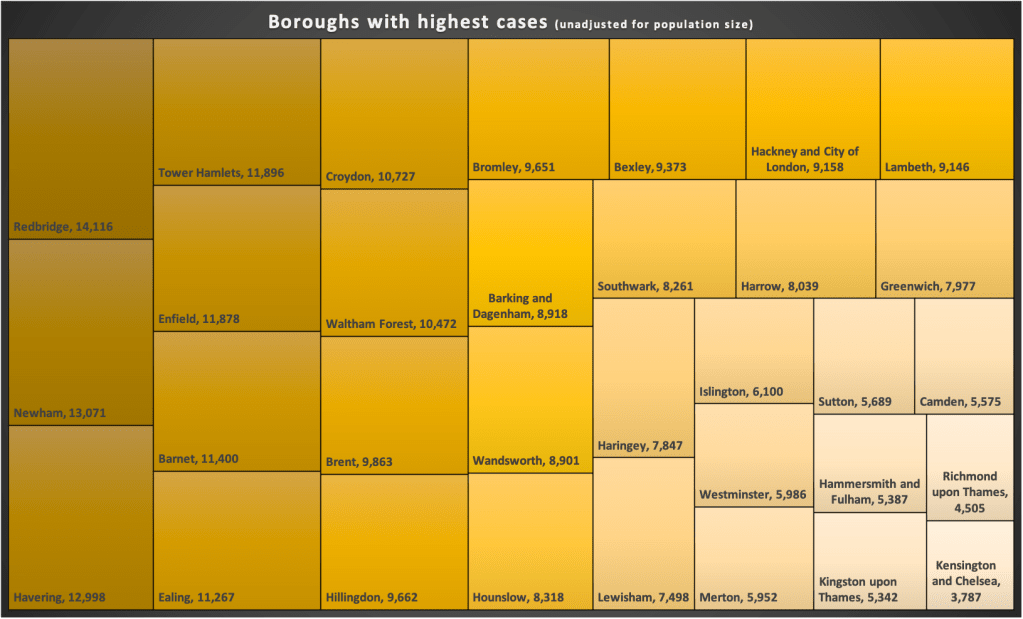
The next bit of analysis focuses on number of cases in each London borough. The treemap above show us which boroughs have had the most cases. Redbridge, the darkest rectangle, being worst effected with 1 in 22 people testing positive since March 2020.
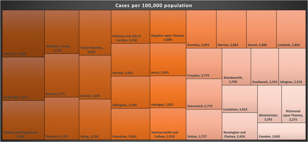
Now the ONS estimated the population of London to be 9 million in 2019 and each borough has a different proportion of that, so the numbers need to be standardised to for better comparison. Well, the above treemap shows cases per 100,000 people. Havering takes top spot with 5,008 in every 100,000 confirmed Covid-19 infections. The biggest mover here is Kingston upon Thames. Despite having the sixth fewest cases in London, proportionately it has the fourteenth highest number. Similarly, Barking and Dagenham’s 9k looks better than it is with 1 in every 24 having had the virus. Conversely Croydon, whilst having a higher number of cases, has a 1 in 35 rate. Perhaps social distancing is better observed in Croydon than Kingston.
An analysis on Covid-19 cases in London
Tweet
